Final access • $199 one-time • Lifetime use
.avif)
$249 total
Final Release.

🔥 Final Release — Ending Soon. Own All 3 Systems Forever.


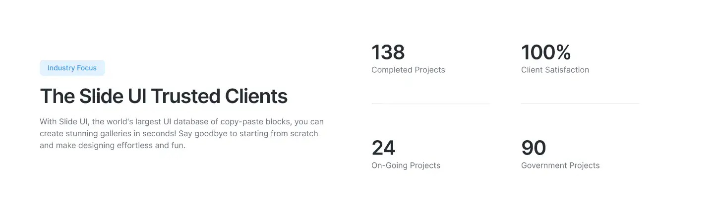
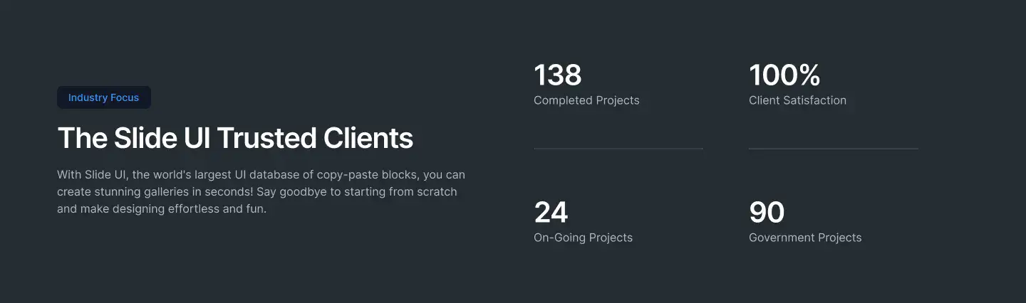
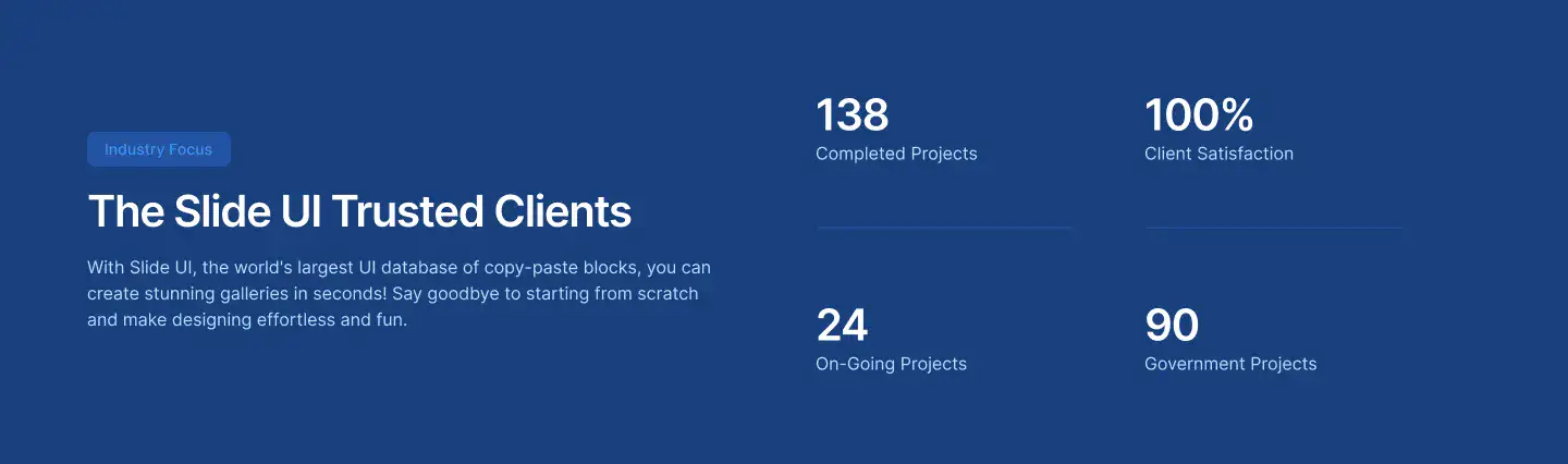
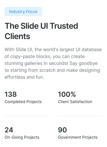
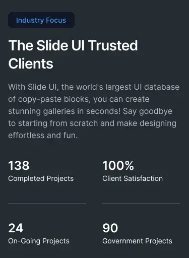
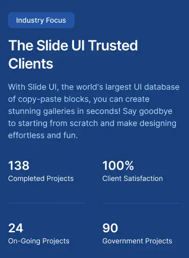
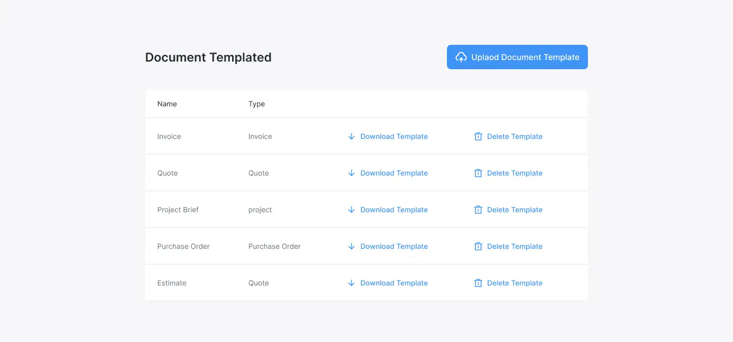
Trusted Badges Layout — Minimalist

Trusted Badges Layout for Figma — minimal, themeable and responsive across Desktop, Tablet and Mobile. Includes Light, Dark and Accent modes for fast customisation. Ideal for Events, Healthcare, Job Board.
This is the world’s largest UI/UX system — 11,000+ pixel-perfect components and 17,000+ connected blocks — all built natively for Figma. Everything is pre-linked, responsive, and toggle-ready.
No more duct-taping templates. No more messy files. Just one system for speed, clarity, and consistency.
Time. Money. Stress.
Every designer knows the pain — scattered files, random templates, and rebuilding from scratch on every project. It’s not just slow — it’s career-limiting. Agencies bleed time. Freelancers stay stuck. Juniors can’t deliver. Marketers can’t test fast enough. You end up fighting fires instead of scaling.
Design shouldn’t be about re-doing the same tasks. That doesn’t move the needle or bring in revenue. Our mission is to end that chaos.
Agencies use it to train juniors in hours, not months. Freelancers deliver world-class websites in days, not weeks. Startups launch faster than ever before. The common thread? They all stopped building from scratch — and started focusing on what really matters: scaling businesses, creating better work, and winning clients.

No more rebuilding from scratch. Snap layouts in minutes and launch faster — trusted by the worlds best designers, devs & marketers.

17,000+ connected blocks that just work. Create instantly, scale across clients, and ship polished campaigns without bottlenecks.
.svg)
Never start empty again. Assemble client-ready designs in under an hour — perfect for agencies, marketers, and solo designers.

Templates break. This doesn’t. Built Figma-native with pixel-perfect consistency, auto-layout, and WCAG compliance baked in.
.svg)
Deliver work in minutes, not weeks. Designers move faster, agencies win more clients, and marketers launch without delay.

Whether you’re a solo designer, a fast-moving agency, the system adapts without bloat or lock-in. Systems win, every-time.


Built with frames for
instant adaptability.
Optimized for desktop, tablet,
and mobile.
Connected and adaptable - Simply toggle between modes & themes.
Adjust to any brand style without breaking structure.
This system is 100% Figma-native — no external SaaS, no subscriptions. It installs directly into your Figma workspace, becoming a permanent part of your workflow. Built to be highly adaptable, it scales effortlessly with you and your team. *Please note* - You need Mid-Level Figma Design Experience.
Unlock 17,000+ Layouts
Hand-crafted & fully connected Figma layouts — pixel-perfect, responsive, and ready to launch faster.

Pixel-perfect, fully connected, and proven to launch faster than starting from scratch.


.svg)


Access all 17,000+
customizable Figma screens
Final release: This one-off deal is ending as we move to a monthly agency SaaS model. Once it’s gone, it’s gone. Own the systems today. Scale smarter. Design faster. Outpace 99%.

The world’s largest Figma design library — built in Figma. Drag, drop, and launch without ever starting from scratch.

Used daily by top designers, agencies,
and teams across the US 🇺🇸, Australia 🇦🇺, and worldwide!

Accessibility is built front-of-mind, every step of the way — helping your projects scale without excluding users.
Deliver world-class fortune500 design work with ease and without the extra headcount, stress, or late nights.
Trusted by 10,000+
Designers, Agencies & Teams.
We asked designers what they love most about using our system. Here’s what they told us.
What took me 2 weeks now takes 2 days.
.avif)
I love what took me 2 weeks now takes 2 days. Client approvals also doubled, which I did not expect.
Projects move faster

We wasted hours fixing the same layouts over and over. Deadlines always felt like a sprint we’d lose.
Now revision rounds are cut in half, projects move faster, and clients notice the difference immediately. It feels like we doubled our team without hiring.
My workflow would actually suck without this 😂
I didn’t realise how good it was until I thought about not having it… then I was like, wow, my workflow would actually suck without this 😂
Projects that used to take days now take hours.
I love how big the library is. If I need SaaS layouts, e-commerce, landing pages — it’s all there. I don’t have to hunt or start from scratch anymore. Projects that used to take days now take hours.
From half a day to minutes.
Before, I’d waste half a day just setting things up, searching inspo, building the basics. Now it takes me minutes - I drop in a few blocks, make adjustments and show clients.


“This system will change the way your team works forever. Our design workflow was fragmented before this system. We cut 80% of unnecessary revisions & finally have a system that scales.”

Systems Win. Always.
Design has changed. Scratch work slows you down. Systems win. This is the system — own it once, and stay ahead forever.

FAQs
Got questions?
We got Answers.
Have questions? we’re here to help.
Designer System → The foundation. 10,000+ components, color/type scales, accessibility baked in. Perfect for consistency. Builder → The fastest. 17,000+ drag-and-drop blocks for landing pages, dashboards, and mobile layouts. In our opinion, the best place to start.
OS → Business files. Proposals, pricing templates, contracts — everything you need to manage your freelance/agency workflow (all in Figma).
The system is focused more on websites, landing pages, and mobile web. There are plenty of components you can adapt for apps (cards, dashboards, forms, etc.), but app design is its own category. So yes, while we do offer areas that overlap app design, we heavily focus on web, where speed matters.
Yes, you can use the files locally. The only catch is you’ll need to design inside that file. Publishing to a Team library makes it much easier — you can open any new file and simply toggle on the library, with everything searchable in your side panel.
The Designer System and Builder began as separate products. Components like the logo weren’t originally linked between them. We’ve since updated the System so these are properly linked. Just duplicate the latest file, replace with your logo, publish — and updates will sync.
Because the ones who win move today — not tomorrow.
They don’t wait for better prompts or smarter tools. They build. They publish. They grow. AI gives you speed, but not certainty. It spits out layouts that look the same as everyone else’s — generic, disposable, and impossible to scale without rebuilding everything from scratch.
The truth? Clients don’t pay for guesses. They pay for clarity, control, and results that look like they came from a designer who knows exactly what they’re doing.
Designer’s System is the largest and only fully adaptable design system inside Figma — built for designers who need both speed and total control.
With over 17,000 connected blocks, every layout is precision-built, pixel-perfect, and ready on day one. You’re not waiting on AI to guess — you’re designing with intent.
Because in a world where everyone’s moving fast, speed alone isn’t enough — you need structure.
You need identity. You need to move with purpose, not prompts.This is how top designers, studios, and agencies win today — they stop experimenting and start executing with systems that deliver speed, control, and story at scale.It’s never been more important to stand out.
When everything looks the same, design is no longer just about pixels — it’s about positioning.
Systems give you both: the speed to keep up and the control to rise above.(Even Figma’s CEO Dylan Field says it best — branding is the new frontier. Watch his short clip here).
Yes — components are designed with accessibility and best practices in mind. To hit the very highest AAA standards, you may need to increase font weight/size. Even Apple and Google don’t apply AAA to every element of their ecosystem, but the System gives you a strong, compliant foundation.
All components are built inAuto-layout, which ensures perfect spacing and responsiveness. If you’re brand new, there may be a learning curve.
But you can always detach components (or use a plugin) to move things around more freely. We also include quick-start tutorials to get you through the basics.
A free account works fine. For publishing libraries across Teams, you may need a Figma Professional plan. If not, there are workarounds — you can duplicate files and design within them directly.
Yes, there’s a Lite version. It’s limited, but gives you a feel for how things work.
Yes — you’ll find charts, dashboards, cards, and data components, especially in the Builder. They’re designed to be tweaked quickly with your own brand colours, typography, and padding.
Once you purchase, you fully own the files — no ongoing SaaS subscription required. Just publish them once in Figma, and they’ll always be available in your side panel.
Note:If you prefer SaaS, you can also check out our sister platform app.slideui.com, which offers yearly plans. But if you’re an avid Figma user, the Builder is a must-have — while SaaS can look shiny, nothing beats the speed and control of owning the files directly.
Please note we don’t offer transfers between Slide UI (SaaS) and the Builder (Figma files), as they’re separate products.
Discover Layouts
Beautiful above-the-fold hero layouts for SaaS, eCommerce, portfolios, and startups. Built for clarity, impact, and faster client approval.
View Hero blocksShowcase processes, features, or onboarding in a clean 3–4 step layout. These are perfect for explaining complex ideas simply.
View How It Works blocksHighlight product advantages with icons, metrics, and comparison stats. Designed to build trust and speed up decision-making.
View Benefit / Statistic blocksPerfect for agencies, consultants, and SaaS tools to clearly explain services offered, with icon, card, or list formats.
High-trust testimonial sections with avatars, logos, quotes, or carousels. Designed to increase credibility and conversions.
View Testimonial blocksTechnical details, product highlights, feature breakdowns — structured for clarity and mobile responsiveness.
Conversion-optimized pricing tables, tier comparisons, toggle plans, and value stacks.
Conversion-optimized pricing tables, tier comparisons, toggle plans, and value stacks.
Grid or column-based layouts to highlight your best product features — fast, skimmable, and easy to reuse.
Add story, mission, and credibility to your brand with timeline, image-text, or culture-based layouts.
Organise your blog or knowledge base visually with clean, responsive category cards or grids.
Display posts with preview cards, titles, and tags. Perfect for content hubs or design resource libraries.
Show project results and stories in a professional way. Includes visual storytelling, stats, and client quotes.
Trust-building review blocks that show user feedback, star ratings, or real testimonials with proof elements.
Beautiful navigation blocks — sticky headers, mega menus, mobile navs, and minimal top bars.
Lightweight sections for storytelling, intros, or visual breaks. Ideal for portfolios, agencies, and SaaS.
Responsive footers with navigation, logos, social links, and calls to action. Designed for conversion and clarity.
Thin attention-grabbing strips to highlight features, discounts, awards, or client counts.
Break down feature differences clearly using side-by-side or table-style layouts. Great for upsell pages.
Top banners for alerts, promos, or new features. Works on desktop and mobile, built with Auto Layout.
Drive conversions with call-to-action blocks, email opt-ins, and value stacks. Designed to reduce hesitation.
Contact form blocks with location, socials, support details, and trust signals.
Performance, analytics, revenue, and admin dashboards designed for clarity and real SaaS products.
Sell or display digital courses, tutorials, or lessons with clean layouts and structured flow.
Visual blocks to show awards, press features, partner logos, and verification badges.
Ecommerce-ready cart, checkout, and payment detail blocks optimised for clarity and conversions.
Minimal, branded 404 blocks that guide users back on track. Includes illustrations or CTAs.
Simple privacy terms layout with clear formatting and visual hierarchy.
Authentication blocks built with conversion best practices. Clean, secure, and mobile-optimised.
Showcase product integrations visually with logos, categories, and tool descriptions.
Design community, forum, or support boards with user posts, threads, and activity feeds.
Responsive data table blocks — sortable, readable, and styled for dashboards or admin use.
Ideal for SaaS, clinics, or consultants — built-in date selectors, confirmations, and booking steps.
Scheduling, date picking, or event overview blocks styled for SaaS or booking tools.
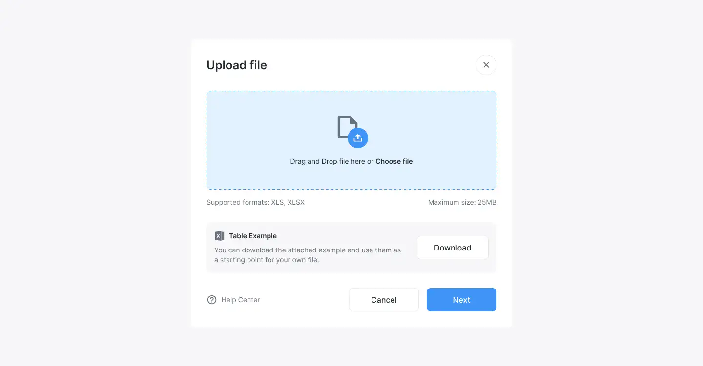
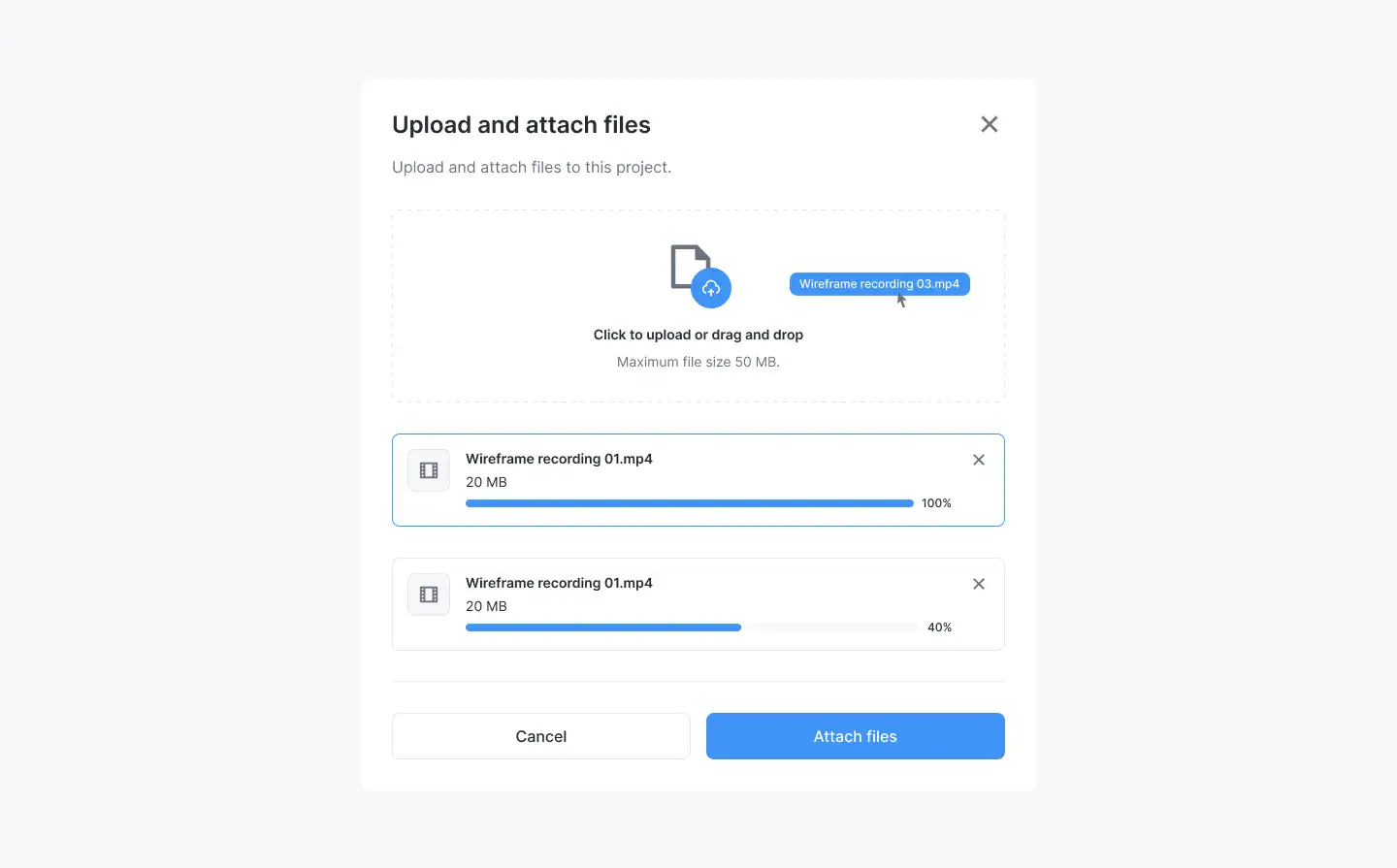
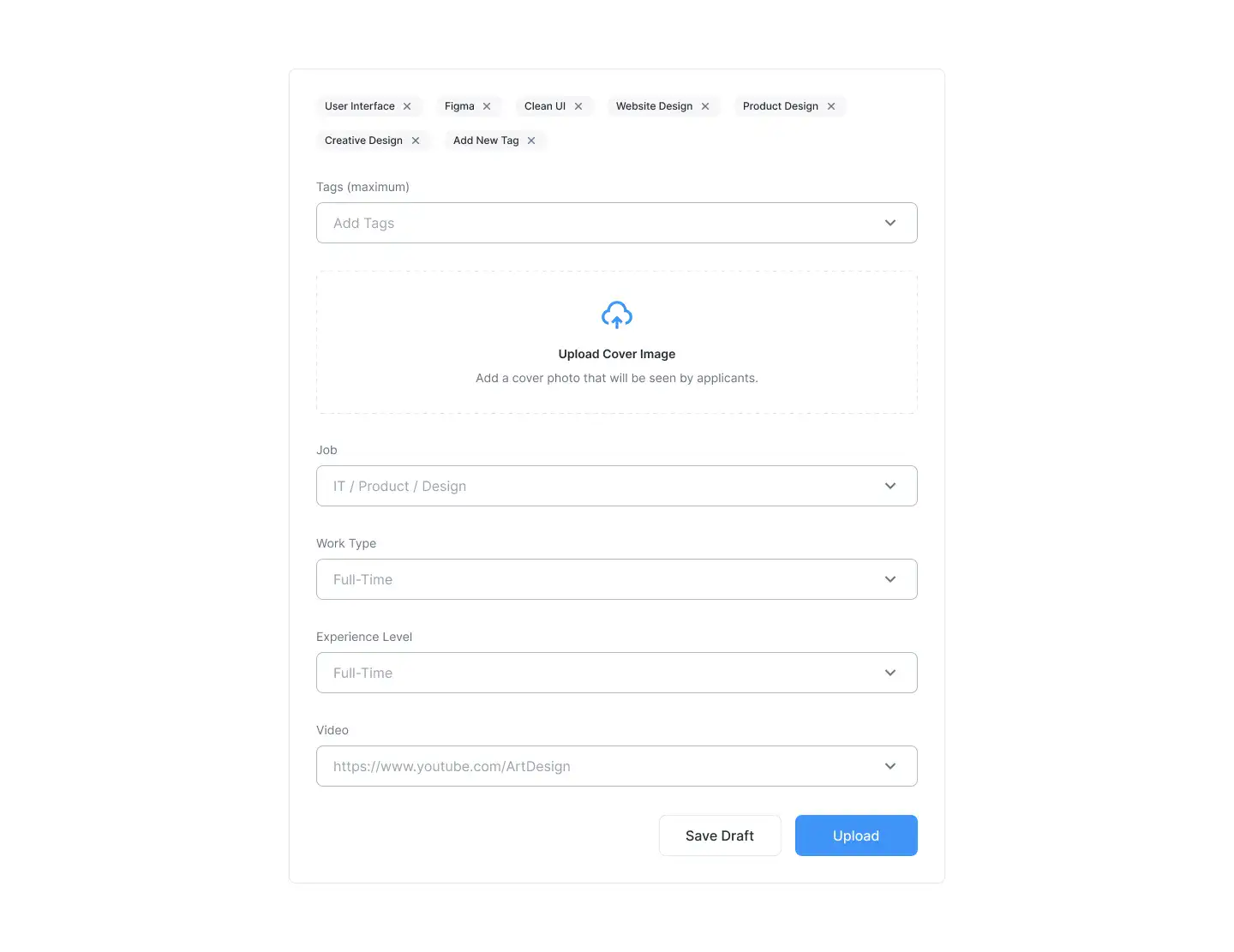
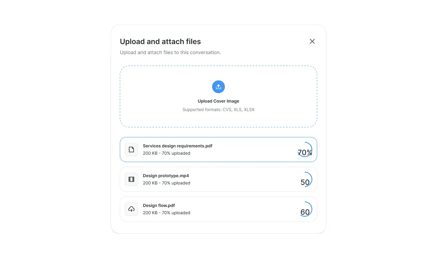
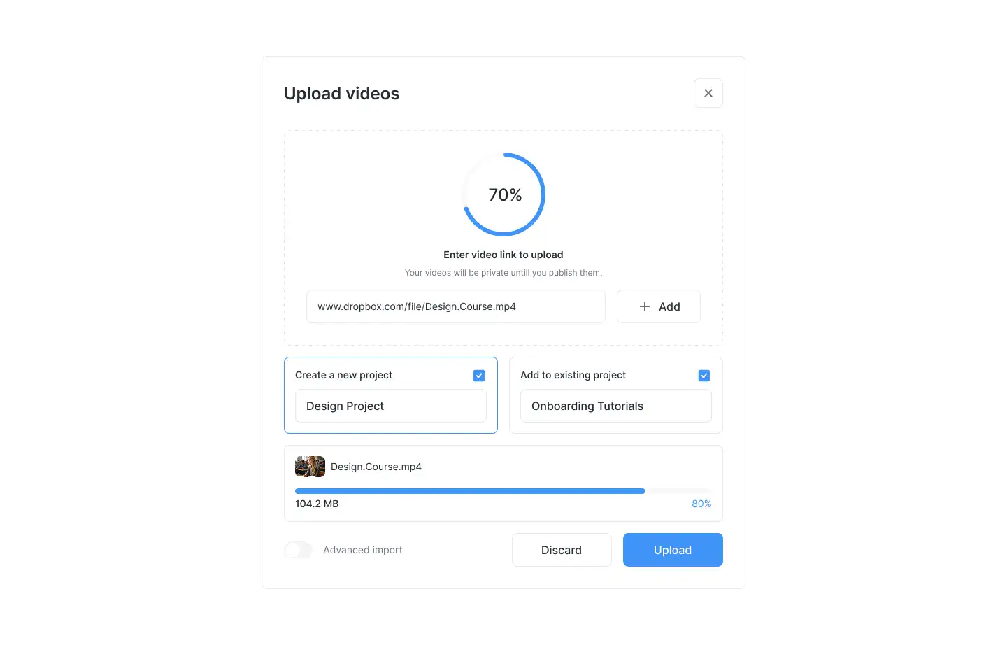
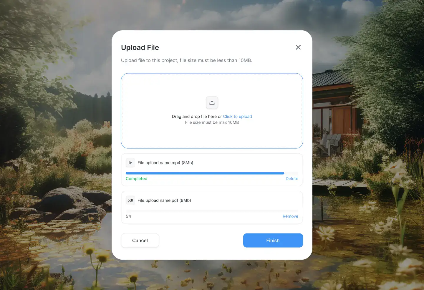
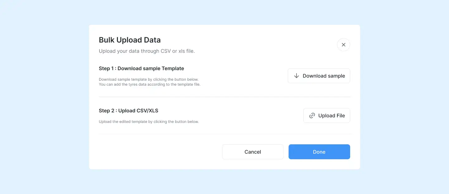
Simple drag-and-drop upload boxes, download areas, or asset release blocks.
Multi-step flows for onboarding, signups, or product tours. Includes visual progress indicators.
Flexible form blocks for surveys, feedback, or onboarding. Designed for ease of use and conversions.
Embed or link social posts, profiles, or share buttons with clean, on-brand UI.